Components Dialog
Used to list all the components of the project into a defined hierarchy. The physical components contained in the VCM are represented in a tree-type child-parent relationship so that you can easily navigate through the component tree hierarchy and locate a specific component(s). The hierarchy can be sorted by source, discipline, area system, and part.
If, at the time you launched ConstructSim Planner, you selected to load a subset of the entire VCM, only those components in the subset display in the dialog.
When you single-click a component, the attributes of the selected component display in the Attributes dialog and highlights in the view. When you double-click a component, the attributes of the selected component display in the Attributes dialog and zooms to that component in the view.


A component can be used in more than one User Defined Group. A component cannot reside in more than one work package of the same activity type. But a component can reside in two different work packages.
By default, the Components dialog is docked to the left side of the application window. Also opens when you select from the ConstructSim menu or select Components from the Tasks dialog.
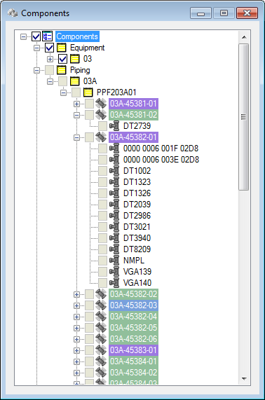
When the Work Package - New dialog is open, the components are marked in the same color as the color legend on the Work Package - New dialog:
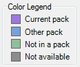
- Purple – These components are in the Work Package and are being worked on presently.
- Blue – These components already reside in a Work Package. A Component can only reside in one Work Package of the same type.
- Green – These components have tasks associated to them and are ready to be added to a Work Package.
- Gray – These components have no tasks available and cannot be added to a Work Package.
To view the properties of the component, select the component and view the properties in the Attributes dialog (by default, docked at the bottom on the application window).